Different stages of the process
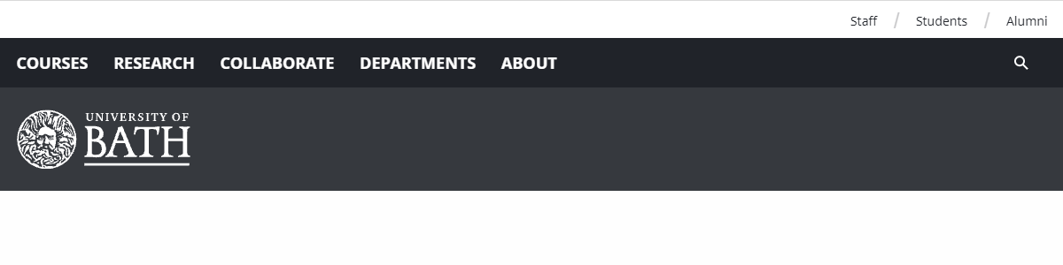
The original blog header
The original blog header placed the logo underneath the global navigation. This seems odd placement as the user has to look down the page to have it confirmed that it is an official University of Bath site.
We wanted our logo to be the first thing that users see when they visit any of our blog pages, which is consistent with other content. By repeating the same look and feel we increase the user's confidence in our brand.
Adding the swap on scroll behaviour
The first step was to relocate the logo and resize the header. There was a lot of pixel pushing involved in getting everything to measure up, as well as changing the $global-width.
I also changed the behaviour of the search tray, so that it was open on medium breakpoint up.

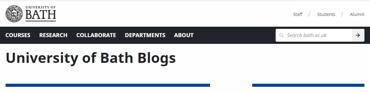
The new blog header after scrolling
After doing some research, I decided to add and remove classes on scroll. Because I'd been trying to repurpose what had been previously used, I ended up having to restructure elements in order to get it working smoothly.
There are some tidy-up tasks I need to do, because changing the global site width has had some knock-on effects as you'd expect. But all in all, it was an interesting project and it's always good to see something you worked on in action.